

Best bumper sticker formats for campaigns, causes and events 2026
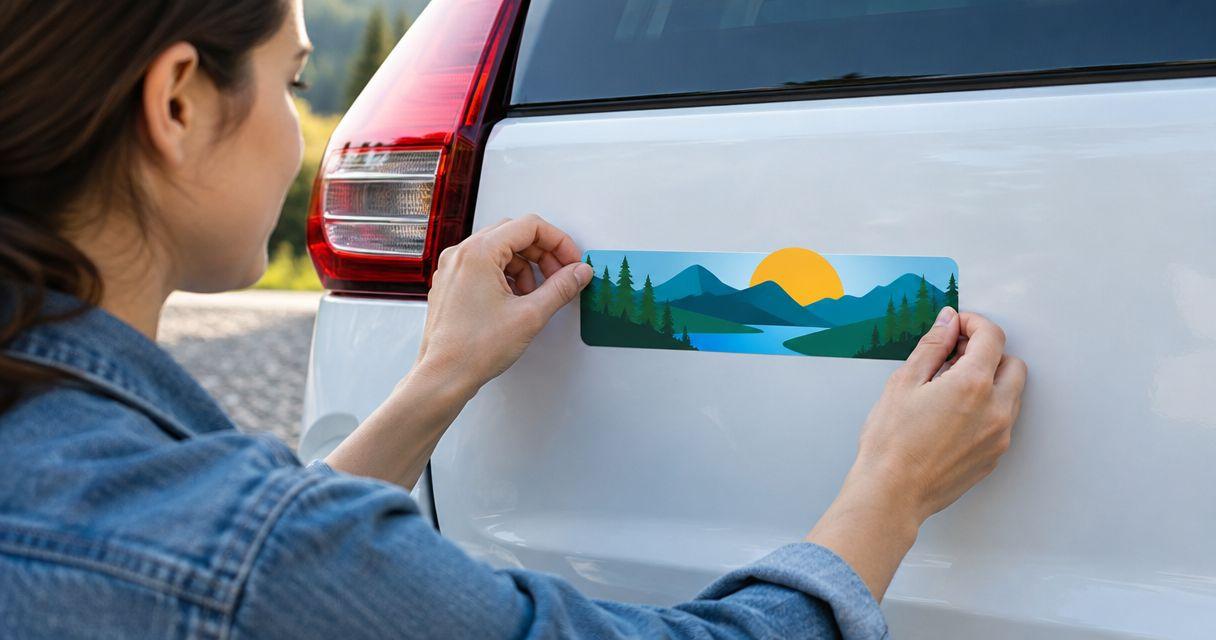
Best for a short campaign message: a rectangle. Best for a cause badge: a circle. Best for a recognizable symbol: a die-cut shape. This guide compares custom bumper stickers by message, placement and artwork so you can choose a useful format for your 2026 campaign, cause or event.
- Rectangle custom bumper stickers suit short campaign messages; circles suit cause badges.
- Die-cut stickers suit recognizable symbols; squares suit compact event artwork.
- QR-code stickers need a parked-reader use case, clear contrast and a real scan test.
- Choose sticker quantities from planned distribution, not an assumed share of attendees.
Why this matters
A sticker handed out at an event has two jobs: communicate something clearly and fit a surface its recipient will actually use. A detailed event graphic does not automatically work on a vehicle. Choose the message first, then build the shape around it.
Vinylstatus prints custom stickers from customer artwork for individuals and small businesses. Vinylstatus serves small businesses ordering custom stickers from their own artwork. For vehicle placement, confirm the selected product’s surface suitability, application instructions and removal guidance before ordering.
What makes the best custom bumper stickers?
Judge your 2026 order against these criteria before comparing shapes:
- Message fit: The shape should accommodate your main phrase without squeezing letters against the edge.
- Placement fit: Measure the intended flat area, including clearance around seams, trim and nearby equipment.
- Recognition: A reader should distinguish the main words or symbol without studying decorative details.
- Artwork control: Check the cut boundary, background, small text and any required attribution before approving a proof.
- Distribution fit: Separate vehicle stickers from packaging labels, volunteer materials and general giveaways when planning quantities.
- Surface suitability: Confirm material and adhesive requirements for the actual application. Shape alone does not establish outdoor performance.
Bumper sticker formats at a glance
These are layout recommendations, not a durability ranking. A circle and a rectangle can carry the same message, but each asks you to make different design compromises.
| Format | Best for | Standout feature | Key limitation |
|---|---|---|---|
| Rectangle | Short campaign statements | Horizontal space follows a line of text | Long copy still becomes crowded |
| Circle | Cause badges | Clear central focus | Curved edges restrict long wording |
| Die-cut | Recognizable symbols | Outline follows the artwork | Detailed edges need careful review |
| Square | Compact event identity | Balanced space for stacked artwork | Event details can overwhelm the design |
| QR-code layout | Parked-reader actions | Connects a physical sticker to a destination | Requires scanning access and clear surrounding space |
A QR-code layout describes the content, not a separate outer shape. It can sit within a square or another suitable format. Choose it because scanning serves the audience, not because every campaign needs a code.
1. Rectangle: best for short campaign messages
A rectangle gives a slogan or campaign statement a natural reading direction. Use one main line where possible, with supporting information clearly secondary. This format works when the words carry more meaning than the illustration.
Best for: Campaigns and causes with a short, readable statement.
Rectangle pros:
- Horizontal space supports ordinary left-to-right reading.
- A clear type hierarchy separates the message from supporting information.
- A simple layout is easy to assess on a paper mock-up.
Rectangle cons:
- Extra endorsements, dates and web addresses compete with the main phrase.
- A wide design needs a suitable uninterrupted placement area.
Do not stretch a logo to fill the rectangle. Keep its proportions and use the remaining space deliberately. If the headline becomes small after adding a web address, remove information before increasing the design’s complexity.
For a 2026 campaign, decide whether the year belongs in the message. Include it when the sticker identifies a specific campaign; omit it when the cause should remain relevant beyond that event.
Verdict: Buy a rectangle when the words are the main reason someone would display the sticker.
2. Circle: best for cause badges
A circle creates a badge-like composition around a central mark or short phrase. It suits a cause symbol with a brief identifier. Keep essential wording away from the curved edge unless the curved arrangement remains easy to read.
Best for: Cause badges built around a central symbol.
Circle pros:
- The center gives the main symbol a clear position.
- A compact composition suits a badge-style identity.
- A restrained design can separate the symbol from supporting words.
Circle cons:
- Long organization names are difficult to fit without shrinking text.
- Edge-following text takes more effort to read than a straight line.
Start with the symbol and add only the words needed to explain it. A recognizable mark does not need every campaign detail around its perimeter. If the name is unfamiliar, prioritize readable identification over decorative border text.
Print the circle at its intended size before approving the layout. Review the smallest lettering independently rather than judging only the central image.
Verdict: Buy a circle for a cause badge; skip it when a long sentence must remain prominent.
3. Die-cut: best for recognizable symbols
A die-cut sticker follows the artwork’s outline rather than a standard geometric boundary. Use it when a distinctive icon, illustration or lettering shape is central to recognition. The outline should support the identity, not become another detail to decipher.
Best for: Campaigns or organizations with a recognizable standalone symbol.
Die-cut pros:
- The outer shape reflects the artwork.
- A symbol can remain the main focus without a rectangular frame.
- A simplified silhouette gives the proof a clear boundary to inspect.
Die-cut cons:
- Thin projections and intricate edges require closer cut-line review.
- An unfamiliar symbol without readable identification can leave the message unclear.
Check narrow gaps, isolated elements and the border around the design. Ask how separate artwork elements will be handled rather than assuming they become one connected sticker.
A silhouette that works on a large poster can lose definition when reduced. Make a full-size paper version and view it against a background similar to the intended placement. Simplify the outline if the identity disappears.
Verdict: Buy die-cut for a strong symbol; hold the order if the cut boundary remains unclear.
4. Square: best for compact event identity
A square accommodates a stacked event name, central illustration or balanced logo arrangement. It is useful when the artwork already has a compact footprint. Treat it as an identity sticker, not a miniature event flyer.
Best for: Events whose name and visual identity work in a compact layout.
Square pros:
- Stacked words have more vertical room than in a narrow rectangle.
- A centered illustration can sit above or below a short event name.
- The straight boundary makes placement mock-ups straightforward.
Square cons:
- Schedules, sponsor lists and venue details quickly crowd the artwork.
- A square still needs an appropriately sized flat placement area.
Choose whether the sticker promotes attendance or commemorates participation. A promotional design needs enough identification to make sense before the event. A keepsake can focus on the event name and identity instead of directions or schedules.
For a 2026 event, include the year only when distinguishing that edition matters. Do not add a date simply to fill empty space.
Verdict: Buy a square for a compact event identity; skip the flyer-style information stack.
5. QR-code layout: best for parked-reader actions
A QR-code sticker gives someone a route to a registration page, donation destination or campaign information. Design it for a person who can stop and scan safely. Do not build an action that depends on a moving driver using a phone.
Best for: Event parking, stationary displays and other permitted placements where readers can approach safely.
QR-code layout pros:
- A scan connects the physical message to a specific destination.
- The printed wording can explain one clear action.
- A destination page can carry detail that would crowd the sticker.
QR-code layout cons:
- Scanning depends on code size, contrast, placement and surrounding clear space.
- A broken or inappropriate destination defeats the sticker’s purpose.
Keep the code’s quiet zone clear. Avoid placing artwork or a cut boundary against it, and do not assume a code that scans on your monitor will scan from the finished placement.
Test the actual destination and a full-size print with the phones your team has available. Check the page title and requested action, not just whether a browser opens.
Verdict: Buy a QR-code layout for a safe, stationary scan; skip it for moving-traffic interaction.
Turn the chosen format into an order
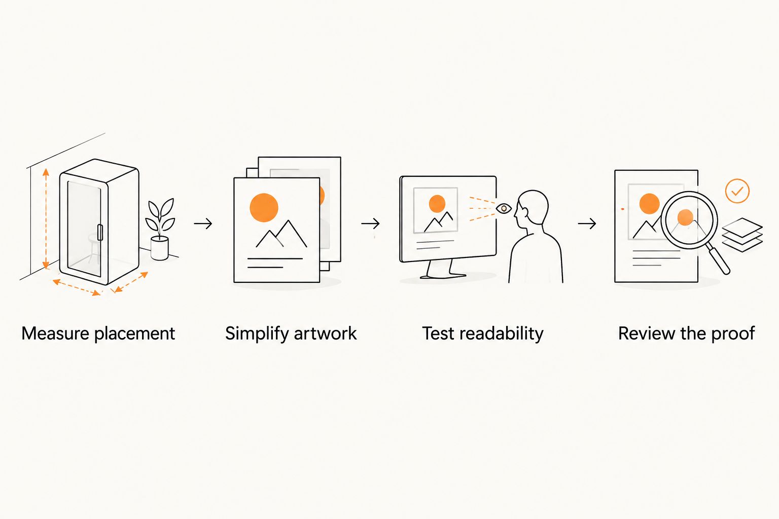
Use this sequence for your 2026 sticker order. Resolve the physical fit before spending time polishing small artwork details.
Measure placement
Measure the usable area rather than the whole bumper. Make 1 paper mock-up at the intended dimensions and position it without applying adhesive. Check that the design does not cover lights, plates, sensors or other vehicle equipment.
Simplify artwork
Prepare 2 layout versions: the full concept and a reduced version containing only the main message and identifier. Compare them at actual size. Keep the version that communicates clearly without explanation.
Test readability
Start with a viewing check from 3 feet away, then test at the distance your placement actually requires. That starting distance is a practical review step, not a guarantee of roadside readability. Remove details that disappear.
Review the proof
Inspect spelling, dimensions, orientation, cut boundary and small text. For QR artwork, check the quiet zone and destination again. Confirm whether the proof shows the final border treatment before approving it.
Proof approval and delivery planning are separate decisions. Ask for the selected product’s production schedule after approval and its shipping estimate separately; build your event deadline around both.
Choose finish and quantity around the job
Finish should support the artwork, not substitute for readable design. Compare matte and glossy samples or product information for glare and appearance. If you consider a holographic format, review how the effect interacts with the actual words and symbols rather than assuming every design benefits.
For Vinylstatus custom stickers, verify the selected format’s material, liner, proof process and application guidance before ordering. Those details matter more than the shape name when deciding whether a product fits vehicle use.
Build quantity from a distribution plan:
- Confirmed use: Count team vehicles and other agreed placements.
- Planned handouts: Estimate from the specific distribution activity, not total event attendance alone.
- Separate applications: Keep packaging labels and vehicle stickers distinct when their specifications differ.
- Useful reserve: Set aside extras for a defined purpose, such as later volunteer requests.
Do not turn every attendee into an assumed sticker user. Ask distribution partners what they can actually hand out, and avoid adding dated stock without a clear use.
How the formats were ranked
The order follows buying questions: words, badge, symbol, event identity, then a scan action. It reflects message fit, placement, recognition and artwork review—not a claim that one shape has better adhesive or lasts longer.
Vinylstatus offers custom sticker formats, but the recommendations here compare design structures. Confirm the exact product specification before treating any option as suitable for a bumper.
Which format should you choose?
Choose a rectangle if you are undecided and your message is primarily text. Choose a circle for a badge, die-cut for a distinctive symbol, or square for a compact event identity. Add a QR code only when the reader has a safe reason and opportunity to scan.
Before placing a 2026 order, approve the message, measured fit and distribution plan together. A readable sticker in a useful quantity is a better ordering decision than a complicated design with no clear placement.
FAQ
What’s the best shape for custom bumper stickers?
A rectangle is the clearest starting point for a short text-led message. Choose a circle for a badge or a die-cut shape when a recognizable symbol carries the identity.
Are die-cut stickers better than rectangular bumper stickers?
Die-cut stickers suit distinctive symbols, while rectangles suit text-led messages. Neither shape establishes durability or adhesive suitability; check the selected product’s specifications.
What size should I order for a campaign bumper sticker?
Choose the size from the measured placement area and an actual-size artwork check. Test a paper mock-up before ordering rather than choosing dimensions from a screen preview alone.
Can I put a QR code on a bumper sticker?
Use a QR code only where someone can approach and scan safely while stationary. Keep the quiet zone clear and test a full-size print that opens the intended destination.
Should an event sticker include the year?
Include 2026 when the sticker identifies that specific event edition. Leave the year out when the message is intended to support an ongoing cause without a date-specific identity.
How many custom bumper stickers should a small business order?
Base the quantity on confirmed placements, planned handouts and a reserve with a defined purpose. Keep packaging labels separate if they need a different size, material or layout.
What should I check before approving sticker artwork?
Check spelling, dimensions, orientation, the cut boundary and the smallest text. For QR-code artwork, also check the quiet zone, scan performance and destination page.
One last thing
The distribution plan is also an artwork check. Ask the person handing out your stickers to explain who should take one and where it should go. If that explanation is unclear, revise the message or intended application before increasing the quantity.
Related guides