

Best car magnet shapes for real estate and service pros 2026

Best default: a rectangle for a clear business name and phone number. Best for a horizontal logo: an oval. Best for a compact badge: a circle. This 2026 guide compares shapes for custom car magnets and explains how to choose a layout that fits your vehicle before you order.
- Choose rectangular custom car magnets when your business name, service and phone number need separate lines.
- Choose an oval for a horizontal logo, or a circle for a compact badge with minimal text.
- Confirm magnetic compatibility and flat panel space before choosing a shape or approving artwork.
- Vinylstatus accepts custom magnet artwork; confirm the vehicle application and available shapes before ordering.
Why shape matters on a working vehicle
A car magnet has two jobs: fit the vehicle panel and make your business easy to identify. A shape that looks good on a screen fails the buying decision if it forces tiny lettering or crosses a door crease.
For real estate agents, that means deciding whether the agent name, brokerage or contact number leads. For service businesses, it means making the trade clear before adding a slogan. Start with that information hierarchy, not a decorative outline.
Vinylstatus offers custom magnets from your artwork. For custom car magnets, confirm vehicle suitability, available shapes and order requirements before treating a design as ready for production.
What makes the best custom car magnet shape?
Use these criteria to judge the shape before comparing artwork:
- Panel fit: The entire magnet needs a suitable surface. Exclude handles, trim, deep contours and panel gaps from your usable area.
- Message fit: Your business name and contact method should fit without squeezing the lettering.
- Logo compatibility: A wide wordmark and a compact emblem need different layouts. Do not distort either to fill a shape.
- Useful blank space: Leave room around the message. An outline that consumes that space creates a design problem.
- Repeatability: If you order for several vehicles, check each intended placement rather than assuming matching doors.
- Handling: Ask for application, removal, cleaning and storage instructions for the actual magnetic material.
For a 2026 order, choose the panel first, the message second and the outline third. Reversing that sequence creates avoidable artwork revisions.
Car magnet shapes at a glance
These are layout recommendations, not a claim that every shape is available from a particular supplier. Confirm the offered format and material before preparing final artwork.
| Shape | Best for | Standout layout feature | Key limitation |
|---|---|---|---|
| Rectangle | Service name plus contact details | Straight edges support separate text lines | Requires a suitable rectangular panel area |
| Rounded rectangle | A framed logo with supporting text | Keeps a rectangular layout with curved corners | Corner curves reduce space for corner details |
| Oval | Horizontal logos with a short message | Wide center accommodates a wordmark | Curved ends restrict long text lines |
| Circle | Compact logos and badge designs | Equal width and height suit a central emblem | Awkward for long business names |
| Contour-cut outline | A distinctive silhouette with minimal text | Outline follows the artwork | Complex edges complicate layout and handling |
1. Rectangle: best for service names and contact details
A rectangle gives you a straightforward arrangement: business name, service and contact method on separate lines. For a plumber, cleaner or landscaping business, that structure keeps the service description from competing with the logo.
The rectangular layout is the best default for a text-led car magnet. It gives you a simple starting point without requiring the reader to follow curved lettering or interpret a silhouette.
Rectangle pros:
- Straight edges make aligned text blocks easy to arrange.
- A wide format accommodates a horizontal wordmark.
- Separate lines let you distinguish the business name from the service.
Rectangle cons:
- A door crease can eliminate otherwise useful panel space.
- Filling every corner makes the design crowded.
For a real estate layout, decide whether the agent name or brokerage leads before adding a phone number. Check applicable brokerage and advertising requirements before removing required information to simplify the design.
Best for: Businesses whose main message needs separate lines rather than a central badge.
Verdict: Choose a rectangle when clear text is the main job.
2. Rounded rectangle: best for a framed logo layout
A rounded rectangle retains the familiar text area of a rectangle while changing the corner treatment. Choose it when your existing artwork already uses a border, capsule-like frame or rounded background.
The benefit is layout continuity, not a proven improvement in vehicle performance. Do not assume rounded corners make a magnet suitable for a curved panel or eliminate the need for correct application.
Rounded rectangle pros:
- Supports the same basic text hierarchy as a rectangle.
- Works with artwork that already has rounded framing.
- Provides a clear outer boundary without following a detailed logo contour.
Rounded rectangle cons:
- Text or graphics placed near corners lose usable room.
- A border makes uneven spacing more obvious in the proof.
Keep the phone number and small supporting text away from the corner curves. If your logo includes a rectangular frame, check whether the rounded outer cut creates an unintended second border.
Best for: Businesses with a framed logo that needs supporting contact text.
Verdict: Choose a rounded rectangle for artwork compatibility, not an assumed durability advantage.
3. Oval: best for a horizontal logo and short message
An oval gives a wide wordmark a central home. It works as a layout choice when you can keep the information brief and use the narrower ends as blank space rather than trying to fill them.
For a real estate agent, an oval can organize a horizontal name treatment with a short contact line underneath. If required brokerage details make the lettering too small, return to a rectangle instead of compressing the text.
Oval pros:
- The wide center suits horizontal logo arrangements.
- Curved ends create a natural boundary around a short message.
- A centered layout works without corner decorations.
Oval cons:
- Long supporting lines compete with the narrowing ends.
- A wide oval still requires enough uninterrupted panel space.
Do not bend a phone number around the perimeter simply to make it fit. Keep the contact line straight and check it at the intended physical size.
Best for: Horizontal logos with limited supporting text.
Verdict: Choose an oval when the center carries the message and the ends can stay clear.
4. Circle: best for a compact badge or emblem
A circle suits a logo designed around a central symbol, initials or a short badge name. Its equal width and height make it a different buying decision from a wide text panel.
A square artwork canvas has a 1:1 aspect ratio, but a circular cut removes the corners of that canvas. Keep critical details inside the circular boundary rather than checking only the square file preview.
Circle pros:
- Fits existing circular emblems without changing their basic arrangement.
- Gives a central symbol a clear focal position.
- Avoids the need to extend a compact logo across a wide panel.
Circle cons:
- Long business names consume space quickly.
- Adding several contact methods weakens the compact layout.
For a service business, a circle is a poor substitute for a readable service description when the logo alone does not explain the trade. Remove optional details or choose another shape.
Best for: Recognizable badge artwork with very little supporting text.
Verdict: Choose a circle for a badge, not for a crowded contact directory.
5. Contour-cut outline: best for a simple silhouette
A contour-cut magnet follows an artwork outline instead of a standard geometric boundary. The useful version is a simple silhouette that leaves enough room for the business message.
Do not assume a printed sticker's available cut options also apply to vehicle magnets. Confirm the proposed outline with the magnet supplier before spending time refining it.
Contour-cut outline pros:
- Follows a distinctive existing logo silhouette.
- Removes background areas that are not part of the design.
- Gives a simple symbol a defined outer shape.
Contour-cut outline cons:
- Narrow extensions and intricate edges need supplier review.
- Contact details can become secondary to the silhouette.
- More complex outlines require extra attention during handling and storage.
Keep necessary text within a substantial central area. If the design depends on thin projecting details, ask whether simplifying the cut is required.
Best for: A simple, recognizable silhouette with minimal supporting information.
Verdict: Choose a contour cut only after the supplier confirms the outline is suitable.
Turn your shape choice into an order-ready layout
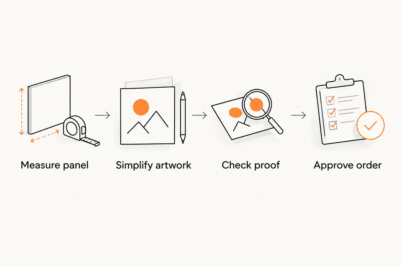
Use this sequence for a 2026 vehicle-magnet order. Settle the physical placement before polishing the artwork; a finished design does not solve an unsuitable panel.
Measure panel
Check that the intended area accepts a magnet. Aluminum, plastic and composite body panels do not provide the same magnetic attachment as a suitable steel surface; confirm the actual panel rather than relying on the vehicle model name.
Measure the uninterrupted area inside trim, handles and seams. Make a full-size paper template and hold it against the parked vehicle. Test every intended placement separately.
Simplify artwork
Choose a leading message and a primary contact method. A service business can lead with the trade; a real estate agent needs to balance name recognition with required brokerage information.
Print the layout at 1:1 scale. Check the lettering on the physical print, not just a zoomed screen. Remove optional text before shrinking essential details.
Check proof
Compare the proposed cut boundary with the artwork. Check spelling, phone digits, logo proportions, margins and whether any border follows the outline evenly.
Ask Vinylstatus which proof and artwork-check process applies to the proposed custom car magnets. Confirm material instructions and shape availability as part of that discussion, rather than assuming sticker ordering details apply.
Approve order
Approve only after the vehicle placement, artwork and specifications agree. Record the final dimensions and intended placement so a later reorder does not depend on memory.
Separate production time after approval from shipping time when planning a deadline. Confirm both for the actual magnet order before scheduling a vehicle promotion.
Quantity follows vehicle use, not the outline
For a 2026 order, list the vehicles, intended placements and any justified replacements. Do not multiply an untested layout across a fleet.
Check whether different vehicles need different dimensions. A shared logo does not guarantee a shared panel size, and a magnet intended for a door should not automatically become a rear-panel design.
Before ordering from Vinylstatus, use the contact page to confirm vehicle use, available shapes, proof arrangements and care instructions. Ask those questions together so the artwork and ordering decisions stay connected.
How the shapes were ranked
This 2026 ranking prioritizes panel fit, text space and compatibility with common logo arrangements. Rectangles lead for text-led layouts; circles and contour cuts serve narrower artwork needs.
The ranking does not compare brands, road testing or material performance. Those decisions require the specifications and instructions for the actual magnet you order.
Which car magnet shape should you choose?
Choose a rectangle unless your artwork gives you a clear reason to choose something else. It is the simplest starting point for a business name, service and contact line.
Choose a rounded rectangle for framed artwork, an oval for a horizontal wordmark, a circle for a compact badge, or a contour cut for a supplier-approved silhouette. In every case, the vehicle panel has the final say.
FAQ
What’s the best shape for custom car magnets?
A rectangle is the best default for a text-led car magnet because it accommodates separate business, service and contact lines. Choose another shape when your logo arrangement and vehicle panel support it.
Are oval car magnets better for real estate agents?
An oval suits a horizontal name or logo with limited supporting text. Choose a rectangle instead when required brokerage information makes the oval layout crowded.
Should a service business choose a circle or rectangle?
Choose a rectangle when the service description and contact details need space. Choose a circle when a compact badge carries the message without adding several text lines.
Will a car magnet stick to every vehicle door?
No, magnetic attachment depends on the panel material and surface. Confirm the actual mounting area and follow the magnet supplier’s instructions before ordering.
Can I use the same magnet size on every company vehicle?
Use the same size only after checking every intended panel. Handles, trim, seams and body contours can require different dimensions or placements.
Can I use a QR code as the main contact method?
Do not make a QR code the only contact method on a vehicle magnet. Keep essential contact information readable and test any code at final size for use while the vehicle is safely parked.
What should I check before approving a car magnet proof?
Check the cut boundary, spelling, contact details, logo proportions and clear margins. Separately confirm that the final dimensions fit the intended vehicle panel and that you have the correct care instructions.
One last thing
Your logo does not have to determine the magnet's outer shape. A circular emblem can sit inside a rectangular layout, leaving space for a readable service description and phone number.
Before committing to a 2026 bulk order, compare that simple arrangement with the decorative alternative at full size. Keep the version that makes your business and next action easiest to understand.