

Best custom sticker formats for mylar bag and pouch packaging 2026

Best default for a compact front label: square stickers. Best for a round logo: circle stickers. Best for a shaped brand mark: die-cut stickers. This 2026 guide compares custom mylar bag stickers by placement, artwork and handling, with holographic finishes and QR codes reserved for specific jobs.
- Square custom mylar bag stickers suit compact front labels; measure the pouch’s flat panel before choosing dimensions.
- Circle stickers suit round logos; die-cut stickers suit artwork whose outline matters.
- Holographic finishes add a reflective effect; keep essential packaging information easy to read.
- Vinylstatus offers custom sticker formats; choose by packaging function rather than decoration alone.
- Approve artwork at actual size and test a representative label on a filled pouch before a bulk order.
Why the sticker choice matters
A flexible pouch does not behave like a flat cardboard box. Filling, opening and handling change its surface, so a label that looks right on an empty bag still needs a practical placement check.
Vinylstatus offers custom stickers from your artwork, including square, circle, die-cut, holographic and QR-code options. For custom mylar bag stickers, Vinylstatus is a fit for small businesses supplying their own artwork and choosing among these formats. Start with the label's job, then choose its appearance.
A front logo label, an information panel and a scan-to-instructions label have different requirements. Do not force every task onto the smallest sticker that fits your logo.
What makes the best custom mylar bag stickers
Use these criteria to choose a format for your 2026 packaging order:
- Usable panel: Measure the flat area on a filled pouch, excluding the zipper, gusset, seams and strong folds.
- Information load: Separate a simple brand mark from ingredients, directions or other required information.
- Artwork shape: Match the sticker outline to the logo only when that outline improves recognition or placement.
- Finish and contrast: Judge small text against the chosen surface effect, not only against a white screen.
- Application workflow: Check liner removal, alignment and handling with the people who pack your orders.
- Proof and sample checks: Review the cut line and actual-size artwork, then assess a physical label on representative packaging.
No shape proves that an adhesive suits your pouch. Confirm the sticker material and intended application before treating a visual match as a purchasing decision.
Custom mylar bag stickers at a glance
These are distinct ordering choices, not five mutually exclusive constructions. Square, circle and die-cut describe outlines; holographic describes an effect; a QR code describes content and function. Your final specification can combine them.
| Format or option | Best for | Standout feature | Key limitation |
|---|---|---|---|
| Square | Compact front-panel branding | A regular footprint for aligned artwork | Corners need clear space away from folds |
| Circle | Round logos and short brand messages | A continuous outline without corners | Curved edges restrict text layout |
| Die-cut | Logos with a recognizable silhouette | A cut line that follows the artwork | Detailed outlines require closer proof review |
| Holographic | A decorative accent on a simple label | A reflective visual effect | Reflections can compete with fine detail |
| QR-code | Linking packaging to digital information | A scannable route to a destination | Requires scan testing on the finished pouch |
1. Square stickers: best for compact front-panel branding
Square stickers give a centered logo and short supporting line a regular boundary. They suit a pouch with a usable front area that accommodates the full label without crossing a fold or closure.
Use the square as a layout constraint. If your information only fits after shrinking the text beyond comfortable reading size, change the layout rather than squeezing everything into the shape.
Square sticker pros:
- Straight edges help you judge alignment against a pouch panel.
- A regular footprint supports consistent placement across a product line.
- The layout can separate a logo from a short variant name.
Square sticker cons:
- Corners require attention near creases and curved areas.
- Long horizontal logos can leave unused space above and below.
- Dense information can overwhelm a compact square.
Best for: A small business using a short logo lockup and a concise product identifier on the pouch front.
Verdict: Buy square stickers when the complete layout fits comfortably inside the measured flat panel.
2. Circle stickers: best for round logos and simple badges
Circle stickers work naturally with circular logos, emblems and short centered messages. Their continuous outline removes the corner-placement question, but it does not remove the need to avoid seams and folds.
Keep the important content toward the center. A circle's outer boundary leaves less room for text near the top and bottom than a square of the same width.
Circle sticker pros:
- Round artwork fits without adding a competing outer shape.
- A centered composition supports a clear brand badge.
- The outline has no corners to align individually.
Circle sticker cons:
- Long product names are harder to arrange within the curved boundary.
- Multiple text lines need careful spacing.
- A circle is not an efficient substitute for a dense information panel.
Best for: A round logo with minimal supporting copy on a front-facing pouch panel.
Verdict: Buy circle stickers for a round brand badge; skip them for crowded instructions.
3. Die-cut stickers: best for a recognizable logo silhouette
Die-cut stickers follow a custom outline around the artwork. Choose this format when the logo's silhouette contributes something useful, rather than selecting a complicated shape just because it is possible.
Inspect the cut line separately from the printed design. Narrow extensions and tightly spaced details deserve attention because the finished sticker must remain practical to peel, position and handle.
Die-cut sticker pros:
- The outline can preserve a distinctive brand-mark shape.
- Unnecessary surrounding space can be removed from the design.
- A simple silhouette can work as a dedicated front brand label.
Die-cut sticker cons:
- Complex outlines need more careful proof review.
- Irregular shapes can be harder to position consistently by eye.
- The shape often leaves less room for supporting product information.
Best for: A recognizable symbol or short logo whose outer contour is part of the identity.
Verdict: Buy die-cut stickers when the silhouette matters; hold if the outline makes application harder without helping recognition.
4. Holographic stickers: best for a decorative brand accent
Holographic stickers introduce a reflective effect. On pouch packaging, that effect belongs where the artwork stays understandable as the viewing angle changes.
Treat holographic as a finish decision, not a replacement for choosing dimensions and a cut shape. Check how the intended print treatment interacts with the reflective material before approving the artwork.
Holographic sticker pros:
- A reflective effect creates a clear decorative distinction.
- Simple artwork gives the effect room without crowding the label.
- A separate accent label keeps decoration apart from detailed information.
Holographic sticker cons:
- Reflections can compete with small text and fine linework.
- Screen artwork does not demonstrate the physical effect under light.
- Pairing a reflective label with reflective packaging needs a physical readability check.
Best for: A simple decorative brand mark that does not carry dense instructions or essential small print.
Verdict: Hold the bulk order until a physical example confirms that the artwork remains readable.
5. QR-code stickers: best for instructions and digital destinations
QR-code stickers connect packaging to a web destination, such as product instructions or a relevant information page. The code must remain scannable after application, not merely inside the artwork file.
Use a stable destination and explain what the scan provides. Keep the code on a flat area with clear contrast and an unobstructed quiet zone around it; avoid treating an untested code as decorative artwork.
QR-code sticker pros:
- A code gives buyers a direct route to digital information.
- A separate code label keeps its placement independent of the main logo.
- A clear destination description tells buyers why to scan.
QR-code sticker cons:
- Folds, glare and distorted placement can interfere with scanning.
- An incorrect or retired destination defeats the label's purpose.
- A code does not automatically replace legally required on-pack information.
Best for: Instructions or supporting information that benefits from a digital destination.
Verdict: Buy only after the printed code scans reliably on the filled pouch.
Measure the pouch before choosing dimensions
For your 2026 packaging specification, measure the filled bag rather than relying only on its listed overall dimensions. Mark the proposed label area on the actual packaging and check it from the front and side.
For example, suppose your usable flat panel is 3 inches wide. Leaving 0.25 inch on each side gives a 2.5-inch label width. This is a layout example, not a universal clearance requirement; your pouch construction determines the usable area.
Follow this sequence before requesting a proof:
- Fill the pouch: Use a representative fill level so bulges and folds appear.
- Mark the panel: Identify the area clear of the zipper, seams and gusset.
- Place the template: Cut a paper outline to the proposed finished dimensions.
- Check handling: Hold, open and set down the pouch with the template positioned.
- Review artwork: Print the design at actual size and assess the smallest text.
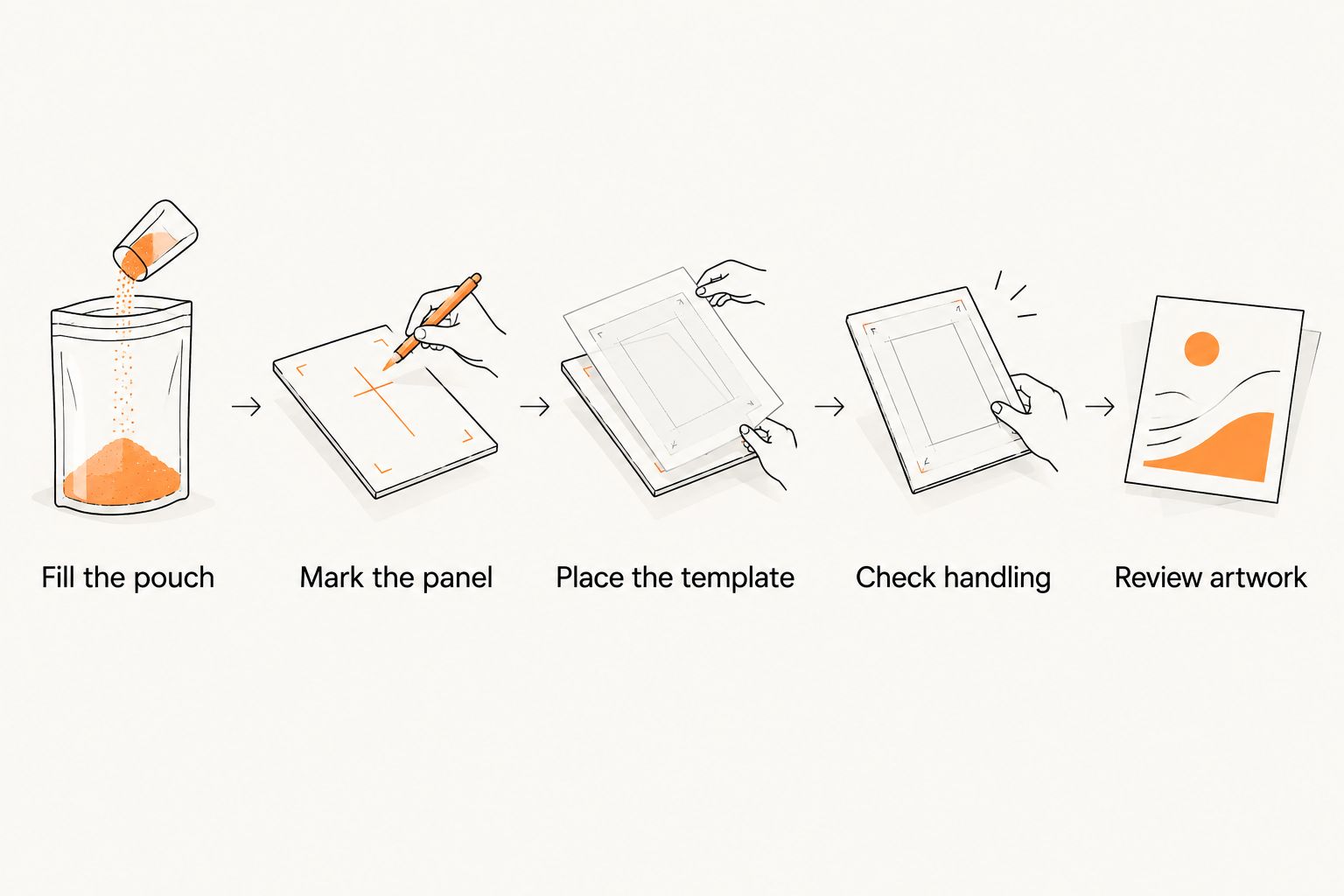
A paper template checks size and placement, not adhesive performance. Test a representative physical sticker separately and inspect for lifting, wrinkling and interference with normal opening.
Approve the artwork, not just the logo
A useful proof review checks the complete label specification. Compare the finished dimensions, cut line, text, orientation and any code destination against your order requirements.
Ask about an online proof and human artwork review before approval. Confirm whether the review covers file quality, cut-line suitability and obvious layout problems; an artwork check does not replace your responsibility for product information or regulatory wording.
For printed stickers, ask whether split-back liners are included if easier peeling matters to your packing workflow. Confirm production origin when that is a purchasing requirement, rather than assuming it from the shop's location.
Use these proof checks:
- Text: Read every word at actual size, including variant names.
- Cut line: Check the border and spacing around important artwork.
- Finish: Confirm the intended surface treatment and its effect on readability.
- Code: Scan the final QR artwork and verify the destination.
- Order details: Match dimensions, quantity and artwork version to the purchase.
For a 2026 launch, keep proof approval, production and shipping as separate scheduling steps. Ask when production starts after approval and how transit time affects the arrival date; do not treat a production estimate as a delivery promise.
Choose a quantity your business can use
Start with expected packaging use, not the attraction of a larger batch. Separate artwork by product variant before deciding how many labels belong in each order.
Calculate the required quantity from planned packed units, expected application waste and any genuine extra uses. Keep those extras explicit. A logo sticker used for packaging and giveaways serves two demand sources, but a variant-specific label does not automatically suit both.
For a 2026 reorder, review how many labels remain usable after any changes to ingredients, instructions, product names or destinations. A generic front logo can remain useful when a detailed product-information label needs revision.
How the formats are ranked
Square stickers lead as a practical default for compact front branding, not as a claim of better material or adhesion. Circle and die-cut follow for specific artwork shapes; holographic and QR-code options answer separate decorative and functional needs.
The ranking uses panel fit, information load, artwork shape, readability and application workflow. It does not assume that every pouch uses the same film or that every sticker construction suits every surface.
Which format should you choose?
Choose square stickers first if you need a straightforward front label and your artwork fits the measured panel. Choose circles for round logos and die-cut outlines only when the silhouette adds value.
Use holographic effects for readable decorative artwork. Add a QR code when the destination serves a clear purpose and the applied label passes a real scan test. Vinylstatus custom mylar bag stickers should begin with that packaging specification, not a finish choice alone.
FAQ
What’s the best shape for custom mylar bag stickers?
Square stickers are a practical default for compact front labels, while circles suit round logos and die-cut shapes suit distinctive silhouettes. The right choice must fit the filled pouch’s usable flat panel.
Can I use holographic stickers on pouch packaging?
Holographic stickers are an option for a decorative label, but readability needs a physical check. Keep fine text and essential information clear under changing light and viewing angles.
What size sticker should I order for a mylar bag?
Choose the sticker size from the usable flat panel on a filled pouch. Keep the label clear of closures, seams, gussets and strong folds, then test an actual-size paper template.
Are die-cut stickers better than circle stickers for logos?
Die-cut stickers suit logos whose silhouette matters; circle stickers suit round artwork. Neither shape is automatically better for adhesion or packaging performance.
Can I put a QR code on a flexible pouch?
Yes, but the printed code needs clear contrast, an unobstructed quiet zone and a flat placement area. Test the applied sticker on the filled pouch and confirm that it opens the intended destination.
Should I approve the proof on my phone?
Check the proof at actual size rather than relying only on a phone preview. Review the dimensions, cut line, smallest text and artwork version before approval.
How do I plan a bulk pouch sticker order?
Base the quantity on planned packed units, expected application waste and identified extra uses. Separate product variants and check whether any information will change before the labels are used.
One last thing
A label can fit perfectly on an empty pouch and fail the placement check after filling. Keep one filled pouch beside the proof during approval. That simple reference connects your artwork decision to the package your customer actually handles.
Related guides