

Best custom wall sticker types for retail and office spaces 2026
Best default for a reception logo: a die-cut logo graphic. Best for directions: cut lettering. Best for changing instructions: a self-contained information panel. This 2026 guide compares custom wall stickers by business use, artwork, placement, and the wall checks you need before ordering.
- Choose custom wall stickers by task: logo graphics, lettering, information panels, QR-code panels, or murals.
- For custom wall stickers, ask Vinylstatus to confirm wall compatibility before choosing a printed format.
- Use a full-size paper mockup to check placement and readability before approving artwork.
- Confirm adhesive suitability and removal instructions separately; a printed proof cannot establish wall compatibility.
Why this matters
A sticker that works on packaging is not automatically suitable for a painted wall. Surface texture, paint condition, adhesive choice, and removal requirements affect the decision independently of the design.
Vinylstatus prints custom stickers and decals from customer artwork. For a wall application, confirm the proposed material and adhesive before treating any printed format as an option. Choose the wall-compatible construction first, then choose the shape and finish.
Your 2026 buying decision should start with the job: identify the business, direct visitors, explain something, connect people to a webpage, or cover a feature wall. These are different design problems. Ordering the same format for all of them creates unnecessary compromises.
What makes the best custom wall stickers?
Use these criteria before comparing shapes:
- Wall compatibility: Match the adhesive and material to the actual surface, paint condition, and intended removal method.
- Reading distance: Judge the smallest important detail from where visitors will stand, not from a zoomed-in artwork file.
- Content shape: Keep logos, directions, instructions, and scan targets in layouts that suit their individual tasks.
- Installation complexity: Account for separate letters, alignment, panel joins, and any transfer material the construction requires.
- Replacement scope: Separate content that changes from graphics intended to remain in place.
- Proof clarity: Confirm finished dimensions, cut boundaries, spelling, orientation, and any panel divisions before approval.
Custom wall sticker types at a glance
These rankings organize layouts by use case, not by adhesive strength or supplier quality. Each option still needs a wall-compatible material specification.
| Rank and type | Best for | Standout feature | Key limitation |
|---|---|---|---|
| 1. Die-cut logo graphic | Reception branding | Outline follows the logo artwork | Fine details complicate sizing and cutting |
| 2. Cut lettering | Room names and directions | Individual letters leave wall visible between characters | Spacing and alignment need careful installation |
| 3. Information panel | Instructions and notices | One bounded layout keeps related content together | A small wording change can require replacing the panel |
| 4. QR-code panel | Connecting visitors to a webpage | Combines a scan target with a clear instruction | Placement and scanning need physical testing |
| 5. Wall mural | Large feature walls | Treats the wall as one visual composition | Measurement, installation, and replacement are more involved |
1. Die-cut logo graphics: best for reception branding
A die-cut logo graphic uses a cut outline around printed artwork. It suits a reception wall when the business name or symbol needs a defined placement rather than a rectangular sign-like background.
Keep the composition simple. A logo that looks clear on a business card still needs a separate review at the intended wall size, especially when it includes a small tagline.
Die-cut logo graphic pros:
- Gives the business identity a distinct outline.
- Keeps the design focused on one recognizable mark.
- Allows printed artwork to remain together within a surrounding cut boundary.
Die-cut logo graphic cons:
- Narrow projections and intricate outlines complicate the cut shape.
- Small taglines can become the limiting factor for readability.
Best for: A reception or meeting area where the logo is the main message.
Before ordering, decide whether the outline surrounds the entire logo or follows separate components. Those are different constructions with different installation demands. Do not assume that a die-cut printed sticker includes transfer material or behaves like individually cut vinyl lettering.
Verdict: Buy a die-cut logo layout when the artwork stays readable and the proposed construction is confirmed for your wall.
2. Cut lettering: best for room names and directions
Cut lettering presents letters or simple shapes without a continuous printed background between them. It fits short room names, department labels, and directional wording where the wall itself should remain visible.
Ask how the lettering arrives and how its spacing is maintained during installation. A clean digital layout does not explain whether you will position separate characters or apply a prepared arrangement.
Cut lettering pros:
- Keeps short messages visually focused.
- Avoids a large background panel around simple wording.
- Supports a consistent naming system across several rooms.
Cut lettering cons:
- Alignment errors are noticeable across a line of text.
- Small punctuation and narrow letter strokes need specific production checks.
Best for: Stable room names and concise directions, not paragraphs.
Prepare the full room-name list before submitting artwork. Check capitalization and arrow direction across the set. If one room name is much longer than the others, solve the shared sizing rule before ordering instead of shrinking that name as an afterthought.
Verdict: Buy cut lettering for short, stable wording; skip it for detailed instructions.
3. Information panels: best for instructions and notices
An information panel keeps text and graphics inside one rectangular, square, or other bounded shape. Use it for collection instructions, visitor check-in steps, or a concise explanation beside a display.
The panel gives the message its own background. That makes it easier to control the relationship between text and background color, although glare and placement still need checking.
Information panel pros:
- Groups a heading, instructions, and symbols into one layout.
- Gives the text a defined background independent of wall color.
- Keeps installation focused on positioning a single panel.
Information panel cons:
- A wording change can require replacing the complete panel.
- Dense copy becomes difficult to read when the panel is undersized.
Best for: A single task that needs a short explanation.
Write the instruction before designing the sticker. Put the action first, then remove details that belong in a longer document. For example, a pickup-area panel needs to explain what visitors should do there, not reproduce the business's entire collection policy.
Verdict: Buy an information panel for a complete, concise instruction; skip layouts that squeeze in unnecessary copy.
4. QR-code panels: best for connecting visitors to a webpage
A QR-code panel pairs a code with wording that explains the destination or action. It suits a wall location where visitors can stop and scan without blocking a doorway or queue.
Preserve the clear margin around the code, use strong contrast, and test the final artwork. A QR code is not a substitute for essential directions that people need without using a phone.
QR-code panel pros:
- Connects a physical location with a specific online destination.
- Keeps longer supporting information off the wall.
- Lets nearby wording explain what the visitor will open.
QR-code panel cons:
- Requires a working phone camera and access to the destination.
- Glare, awkward placement, or surrounding artwork can interfere with scanning.
Best for: Optional supporting information, registration, or a clearly identified webpage.
Test the destination as well as the symbol. Open the page on a phone and complete the intended action. If the panel directs people to an event-specific page, plan its replacement when that information becomes outdated.
Verdict: Buy a QR-code panel only after the actual-size artwork scans from its intended position.
5. Wall murals: best for large feature walls
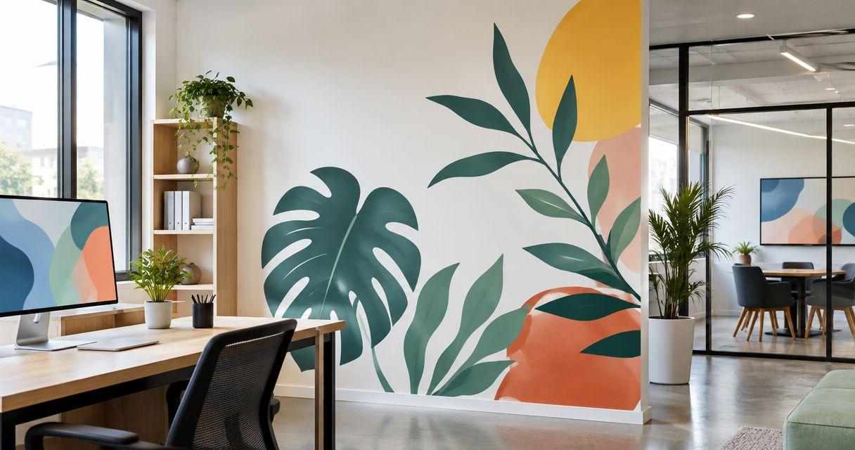
A wall mural uses a broad composition rather than a small standalone label. It fits a feature wall where photography, illustration, or a large graphic treatment is the main objective.
Treat the mural as an installation project. Wall dimensions, obstacles, artwork resolution, and any panel joins need agreement before production.
Wall mural pros:
- Supports a composition designed around the whole wall.
- Gives large illustrations or photographs room to work.
- Allows the visual layout to account for furniture and fixtures.
Wall mural cons:
- Requires more detailed measurement and installation planning.
- Changes or damage can affect a larger portion of the design.
Best for: A planned feature wall with stable content and an agreed installation method.
Do not enlarge a small logo file and assume it will work as a mural. Review the artwork at the intended dimensions, identify joins if applicable, and check where important details fall relative to shelving, doorways, and furniture.
Verdict: Hold the mural order until the wall survey, artwork, and installation plan are complete.
Plan the order before approving artwork
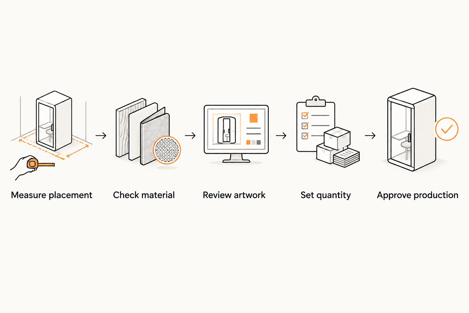
Measure placement
Measure the usable wall area, not just the wall's overall width. Mark switches, corners, shelves, door movement, and anything that blocks the view.
For a planning example, tape up a 24-inch-wide paper mockup and review it from 6 feet away. These are trial dimensions, not minimum specifications. Adjust them to match the actual space and viewing position.

Check material
Give the supplier the wall details and intended use. Ask about paint condition, surface texture, preparation, installation, and removal; do not substitute a general durability claim for a wall-specific answer.
For Vinylstatus custom wall stickers inquiries, describe the surface before requesting a format recommendation. A product's suitability for packaging or giveaways does not establish suitability for painted walls.
Review artwork
Check the finished dimensions, cut outline, smallest text, and orientation. Review matte versus glossy finishes against the lighting at the installation point rather than choosing by appearance alone.
Ask whether online proofs and human artwork checks are included. Keep their roles separate: artwork review checks the file and layout; it does not test adhesion on your wall.
Set quantity
Count intended placements and replacements separately. If you need 10 room labels for 10 doors, confirm whether each label has unique wording before choosing an order quantity.
Do not add extras solely to chase a lower unit cost. Add replacements only where you have a clear use, and keep changing information separate from long-lived branding.
Approve production
Approve the exact artwork version you intend to install. Confirm whether the selected construction has a split-back liner, transfer material, or another application method instead of assuming all printed formats peel and apply alike.
Get the production schedule after proof approval and the shipping estimate separately. If domestic production matters to your purchasing requirements, confirm where the selected product is made.
How these wall sticker types were ranked
The 2026 ranking puts a focused reception logo first, then separates directional, instructional, scanning, and decorative tasks. Each format earns a different use-case slot; none wins every wall application.
The criteria are wall compatibility, readability, content shape, installation complexity, replacement scope, and proof clarity. This is a format-selection guide, not an adhesive test or a claim that every format is offered by Vinylstatus.
Which custom wall stickers should you choose?
Choose a die-cut logo graphic for a reception identity, cut lettering for room names, and an information panel for instructions. Use a QR-code panel when the webpage adds something useful. Reserve a mural for a project with a measured wall and an installation plan.
For an undecided buyer in 2026, start with the smallest clearly defined job rather than a whole-wall design. Specify the message, location, and removal requirements, then use the contact page to ask Vinylstatus whether a suitable construction is offered.
Do not approve production until the material, finished size, artwork, and application method are settled. A confident design choice cannot compensate for an unsuitable adhesive or an unreadable message.
FAQ
What’s the best type of custom wall sticker for a reception logo?
A die-cut logo graphic is the default layout choice when the reception logo needs a defined outline. Confirm that the proposed material suits the wall and that any small tagline remains readable at the intended size.
Are custom printed stickers automatically suitable for painted walls?
No, a custom printed sticker is not automatically suitable for a painted wall. Confirm the adhesive, surface preparation, paint condition, and removal instructions for the specific application.
Is cut lettering better than a printed information panel?
Cut lettering suits short room names and directions; an information panel suits a heading with supporting instructions. Choose by content length and installation needs rather than treating either format as universally better.
How do I choose a size for custom wall stickers in 2026?
Choose the size with an actual-size paper mockup at the intended location. Check the smallest important text from the normal viewing position and account for furniture, fixtures, and glare.
Can I put a QR-code sticker on a wall?
Use a QR-code wall sticker only with a suitable material and a successful actual-size scan test. Preserve the clear margin around the code, provide contrast, and explain what the visitor will open.
Does an artwork proof confirm that a sticker will work on my wall?
No, an artwork proof confirms the proposed design rather than adhesion to your wall. Review dimensions, wording, and cut boundaries in the proof, and confirm surface compatibility separately.
What should I confirm before ordering wall graphics for several rooms?
Confirm the room-name list, shared sizing rules, surface details, and quantity for each design. Separate stable labels from information likely to change so that replacements do not require redesigning the entire set.
One last thing
Your most expensive mistake is not necessarily the wrong shape. It is approving the right-looking graphic for the wrong location.
Before placing a 2026 order, photograph the paper mockup from the visitor's normal approach. Check what furniture hides, where light reflects, and whether the message makes sense without explanation. If the placement fails on paper, fix it before printing.