

Best RV and trailer decal formats ranked by size and visibility 2026
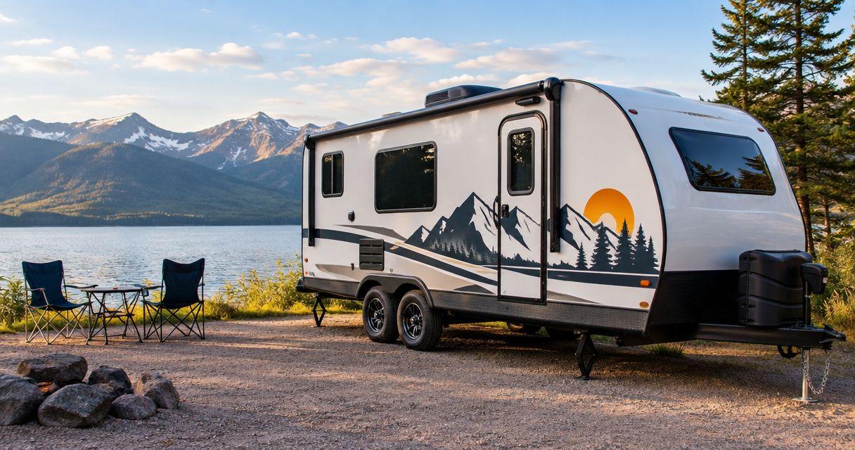
Best for a business name: a large wordmark. Best for a service message: a rectangular panel. Best for a compact logo: a die-cut shape. This 2026 custom trailer decal guide ranks layouts by their communication job; Vinylstatus is an option for small businesses ordering custom printed stickers and decals from their own artwork.
- Choose a custom trailer decal format by message, viewing distance, and usable panel space—not shape alone.
- Large wordmarks suit business names; rectangular panels suit names paired with a short service description.
- Die-cut logos and circles suit secondary branding; QR codes belong where people can stop and scan.
- Vinylstatus suits small businesses ordering custom printed decals from their own artwork; confirm trailer-specific requirements before ordering.
Why format matters on an RV or trailer
A trailer side gives you room, but it also gives you seams, handles, wheel arches, and interrupted viewing angles. A design that looks balanced on a screen can lose its main message when a door opens or a latch crosses the lettering.
For a business trailer, assign the decal a job: identify the company, explain the service, or prompt an action while parked. For an RV, decide whether recognition or decoration matters more. Choose the message before choosing the outline.
What makes the best custom trailer decal format
Use these criteria for a 2026 order. They explain the ranking without treating one shape as universally better.
- Message priority: The business name or main identifier should remain clear without supporting copy.
- Usable panel space: Measure flat, uninterrupted areas rather than the trailer's overall dimensions.
- Viewing situation: Distinguish a passing glance from a parked, close-range interaction.
- Artwork fit: Match the format to the logo's proportions instead of stretching the artwork.
- Installation requirements: Confirm material, surface compatibility, application method, and removal instructions before ordering.
- Proof clarity: Check finished dimensions, cut boundaries, spelling, and orientation before approval.
Trailer decal formats at a glance
These are layout recommendations, not a claim that every format is offered in every size or material. Confirm the construction and dimensions of the actual product before placing an order.
| Rank | Format | Best for | Standout feature | Key limitation |
|---|---|---|---|---|
| 1 | Large wordmark | Business-name recognition | Gives the name most of the available space | Does not explain an unfamiliar business by itself |
| 2 | Rectangular message panel | Name plus service description | Groups related information inside one boundary | Extra copy competes with the main message |
| 3 | Die-cut logo | Distinctive secondary branding | Follows the artwork's silhouette | Detailed shapes need careful sizing |
| 4 | Circle badge | Compact placement near an entry | Provides a contained, repeatable layout | Long names fit awkwardly |
| 5 | QR-code information panel | Parked customer interaction | Connects a physical placement to a destination | Requires close-range access and a successful scan |
| 6 | Decorative stripe | RV styling and visual continuity | Uses length without requiring a text-heavy design | Does not communicate business details |
1. Large wordmark: best for business-name recognition
A large wordmark makes the company name the main graphic. It suits a trailer whose first job is identification, especially when the logo already contains readable lettering.
Keep the name intact. Moving a symbol away from the lettering can help a layout fit, but changing spacing or proportions without reviewing the complete composition can weaken recognition.
Large wordmark pros:
- Gives the business name a clear priority.
- Fits naturally across a long horizontal panel.
- Avoids competition from secondary messages.
Large wordmark cons:
- An unfamiliar name does not explain the service.
- Thin lettering and elaborate scripts need extra scrutiny at viewing distance.
Best for: A business trailer with a short, readable company name and a clear side panel.
Verdict: Buy this format when name recognition is the primary job. Confirm whether the ordered product is a printed decal or another construction; an artwork shape does not establish how the finished graphic is made.
2. Rectangular panel: best for a name and service description
A rectangular panel groups a business name with a brief explanation, such as the trade or service category. Its defined boundary gives you a clear area to organize the message.
Use hierarchy rather than equal-sized lines. The name should lead, the service description should support it, and any contact detail should have a deliberate viewing purpose.
Rectangular panel pros:
- Accommodates a name and supporting text.
- Creates one contained composition to position.
- Provides space for contrast behind the artwork.
Rectangular panel cons:
- A crowded panel makes individual details harder to distinguish.
- A rectangular outline does not solve conflicts with seams or hardware.
Best for: A service business that needs viewers to understand both who it is and what it does.
Verdict: Buy this format when the name alone leaves the service unclear. Remove unnecessary copy before increasing the panel size.
3. Die-cut logo: best for distinctive secondary branding
A die-cut logo uses a cut boundary shaped around the artwork rather than a standard rectangle or circle. It is a practical choice for a recognizable emblem on a door, rear panel, or another measured placement.
For Vinylstatus die-cut decals, review the artwork and requested cut boundary together. Do not assume that the outline shown in a design file establishes the finished dimensions or application method.
Die-cut logo pros:
- Preserves a distinctive outer silhouette.
- Avoids a standard rectangular border.
- Supports a logo-led layout without extra copy.
Die-cut logo cons:
- Fine protrusions and narrow details need careful review.
- A symbol without readable text does not identify every business.
Best for: Secondary branding where the logo's shape contributes to recognition.
Verdict: Buy this format for the emblem, not as a substitute for a readable business name. Ask how fine details will appear at the ordered size.
4. Circle badge: best for compact entry-area branding
A circle works when the artwork is already arranged as a badge or emblem. Place it where someone approaching a parked trailer can inspect it without needing to read across a broad side panel.
Do not squeeze a long horizontal logo into a circle merely to standardize shapes. The resulting lettering can become too small for the intended interaction.
Circle badge pros:
- Contains a compact emblem neatly.
- Makes repeated placements straightforward to plan.
- Suits artwork designed around a central symbol.
Circle badge cons:
- Long names consume space inefficiently.
- Small perimeter text needs close-range checking.
Best for: Entry-area branding, compact emblems, and secondary identification.
Verdict: Buy this format when the artwork already fits a circle. Skip it when the shape forces you to shrink the essential message.
5. QR-code panel: best for parked customer interaction
A QR-code panel gives someone standing near the trailer a route to a specific page. Pair the code with a plain instruction explaining the destination, such as a menu or inquiry form, when that destination exists.
Keep the code's quiet zone clear and test the finished layout. A successful scan on your monitor does not establish that the printed placement will scan under actual conditions.
QR-code panel pros:
- Connects the physical graphic to a digital destination.
- Keeps a long web address out of the main layout.
- Gives parked visitors a specific next action.
QR-code panel cons:
- Requires a phone, accessible placement, and a successful scan.
- Adds little to a graphic intended for passing traffic.
Best for: Parked trailers where visitors can approach safely and stop.
Verdict: Buy this format as a secondary action panel. Do not make a QR code the only way to identify or contact the business.
6. Decorative stripe: best for RV styling
A decorative stripe uses a long graphic to connect sections of the vehicle visually. It serves a different purpose from a business-name panel: appearance comes first.
Plan the complete route before dividing the artwork into sections. Doors, compartment covers, and changes in panel direction affect where a continuous design should stop or restart.
Decorative stripe pros:
- Fits a long, narrow design area.
- Supports a consistent visual direction.
- Does not require a text-heavy composition.
Decorative stripe cons:
- Does not communicate a service or contact method.
- Continuity across separate panels requires careful planning.
Best for: RV owners prioritizing decoration rather than business identification.
Verdict: Hold until you have measured the full layout and confirmed the construction. A stripe is not a replacement for a business message.
Choose dimensions with a full-size mockup
There is no single correct trailer decal size. A format must fit both the available surface and the way someone will encounter it.
For a 2026 layout review, start with paper rather than a reduced image on your phone. The following measurements are mockup examples, not product specifications or minimum readability standards.
- Measure the panel. Record usable width and height in inches, excluding hardware and interrupted areas.
- Mark the footprint. Try a 24-inch-wide paper rectangle, then a 36-inch-wide version if the panel permits.
- Check the distance. Review the main message from a measured position, such as 20 feet away, matching your intended use.
- Open the doors. Check whether movement hides, separates, or interrupts important artwork.
- Revise the layout. Remove copy or change the composition before assuming a larger order will solve it.
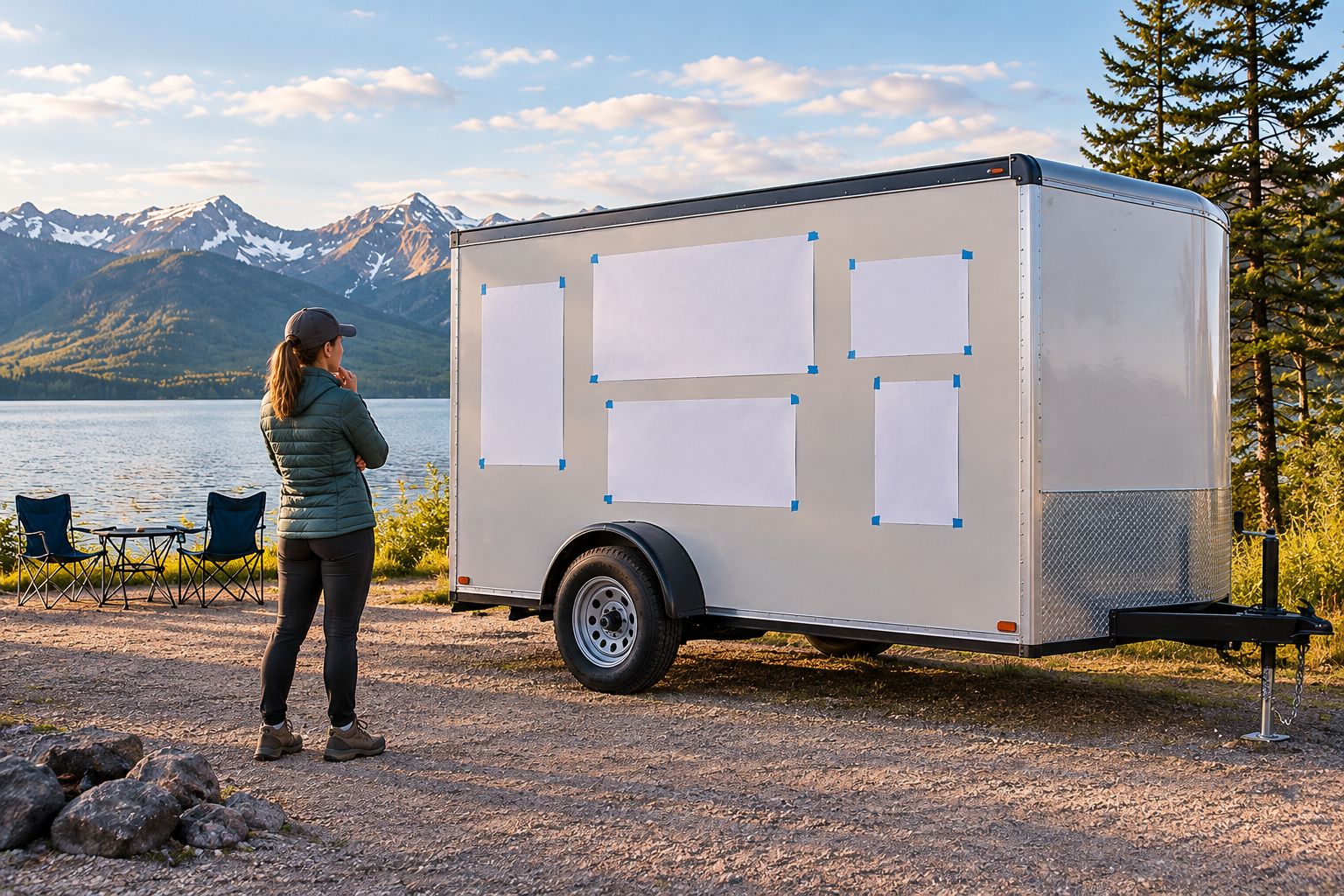
Photograph the mockup straight on and from the angle customers will approach. The straight-on image checks alignment; the approach view checks whether the message remains useful outside the ideal presentation.
Decide whether you need a decal or a larger graphic system
A standalone decal solves a bounded communication problem. A larger vehicle graphic involves more of the body and needs a coordinated layout across those surfaces.
That distinction also applies to food truck vinyl wraps: a design spanning multiple panels raises placement questions that a compact logo sticker does not. Decide the scope before preparing artwork, rather than enlarging a small logo file into an unplanned full-side design.
Choose separate decals when the message fits cleanly within measured placements. Ask about a broader graphic project when the intended design depends on continuity around doors, corners, or multiple body sections.
Prepare artwork and approve the right proof
For a Vinylstatus custom trailer decal order, use free online proofs and human artwork checks to review the design before approval. Keep the discussion specific: finished size, readable lettering, cut boundary, and intended placement.
An artwork check does not replace measuring the trailer or confirming material compatibility. Send the placement requirements with the artwork, and ask which details the proof confirms.
Use this 2026 approval checklist:
- Artwork: Supply a vector file when available; ask for a file-quality check if using raster artwork.
- Dimensions: Confirm finished width and height, not just the file's canvas size.
- Copy: Check names, phone numbers, web addresses, and QR destinations character by character.
- Cut boundary: Review the outline and space around important details.
- Orientation: Confirm which way the graphic faces on each side.
- Application: Confirm the liner, application instructions, surface preparation, and any installation support required.
Ask whether the selected printed sticker uses a split-back liner for peeling. Do not treat easy liner removal as a substitute for an application plan, especially when positioning a larger graphic.
Keep production and delivery separate in your 2026 schedule. Where the selected product's terms specify two-business-day production after proof approval, shipping time is additional; verify the applicable terms before committing to an event date.
Order quantity from actual placements
Count the graphics you will install, not the number that makes an order feel economical. A left-side placement, right-side placement, and rear placement can require different dimensions or layouts.
Separate those versions in the order brief. Check whether a planned spare matches an actual placement, and avoid turning trailer artwork into a giveaway sticker without reviewing its size and message for that use.
Approve the design before committing to repeats. Ordering more copies does not correct a layout that fails its viewing test.
How the formats are ranked
This ranking prioritizes business-name recognition, useful message space, and placement fit. It compares communication tasks, not measured durability, material performance, or supplier quality.
The order changes with the job. A QR-code panel ranks below a wordmark for identification but belongs first when the specific task is helping a parked visitor reach a page.
Which trailer decal format should you choose?
Choose a large wordmark by default for business identification. Choose a rectangular panel when viewers also need a short service description. Add a die-cut logo, circle, or QR panel only when it has a separate job.
For a 2026 order, Vinylstatus is an option for custom printed stickers and decals made from your artwork. Confirm the selected product's trailer-surface suitability, dimensions, and application requirements before approval.
FAQ
What’s the best custom trailer decal format for a small business?
A large wordmark is the default for business-name recognition. Choose a rectangular panel when the name also needs a short service description.
What size should my trailer decal be?
Choose dimensions from the usable panel space and intended viewing situation. Test a full-size paper mockup on the actual trailer before approving the order.
Is a die-cut decal better than a rectangular decal?
A die-cut decal suits a distinctive logo outline; a rectangular decal suits grouped information. Neither format is better for every layout.
Can I put a QR code on a business trailer?
A QR code suits a parked placement that visitors can approach safely. Preserve the quiet zone and test the layout with phones under actual viewing conditions.
Should both sides of a trailer use identical artwork?
Both sides should communicate the same identity, but their layouts need separate checks. Doors, handles, and available panel space can require different positioning or dimensions.
Does proof approval mean the decal will suit my trailer surface?
Proof approval alone does not establish surface compatibility. Confirm the selected material, surface preparation, and application requirements separately.
Does production time include shipping?
Production time and shipping time are separate. Where a product specifies two-business-day production after proof approval, allow additional time for shipping and confirm the applicable order terms.
One last thing
Check the trailer with its doors open before approving the artwork. If an open door hides the business name during your normal working setup, change the placement—not just the decal size.
Related guides