

Circle or rectangle stickers: which fits your packaging
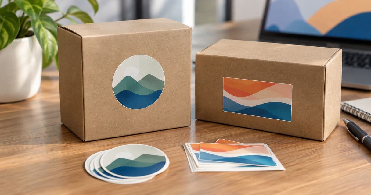
Choose circle stickers for compact logos and centered packaging accents; choose rectangle stickers for wide logos, product names and layouts with several lines of text. For circle vs rectangle stickers for packaging in 2026, the deciding factor is usable space on the actual package—not which shape looks better on a screen.
- Circle vs rectangle stickers for packaging: circles suit compact logos; rectangles suit wider artwork and structured text.
- Test both shapes on the actual box, bag or jar before choosing dimensions or approving artwork.
- Rectangles provide corners for text, but a label that crosses a fold can lose readability.
- Vinylstatus suits small businesses ordering custom stickers from their own artwork.
Circle or rectangle stickers: which fits your packaging?
A circle fits a compact mark; a rectangle fits a longer message. Start with the artwork and the package panel together. A shape that frames your logo neatly still fails if it covers an opening, crosses a crease or leaves your product name too small to read.
Vinylstatus accepts customers’ own artwork for custom stickers. Before preparing an order, decide whether the sticker’s main job is branding, product identification or closing a package; those jobs need different layouts.
| Shape | Best for | Practical advantage | Main limitation |
|---|---|---|---|
| Circle | Compact logos, monograms and centered accents | Creates a clear focal point around compact artwork | Curved edges restrict space for long text |
| Rectangle | Wide logos, product names and organized text | Gives horizontal lines and corner content more room | Needs careful alignment with the package edges |
Neither shape fixes crowded artwork. If your label contains a business name, product name, instructions and a code, simplify the hierarchy before enlarging the sticker.
Why this matters
A packaging sticker has to work twice: once when someone applies it and again when the customer reads it. A layout that looks balanced in a proof can still be awkward to position on a narrow bag or hard to read around a small jar.
For your 2026 packaging order, settle the placement before choosing the quantity. That prevents a design decision from becoming a batch-wide application problem.
Keep the role clear:
- Branding: Make the logo recognizable without competing messages.
- Product identification: Keep the product name easy to find.
- Instructions: Give text enough space to remain readable.
- Closure: Test the shape across the exact opening you intend to cover.
A decorative closure is not proof of tamper evidence. Do not describe an ordinary packaging sticker as a security feature without verified support for that use.
Circle stickers: best for compact logos and centered accents
Choose a circle when your artwork has a compact footprint and one clear focal point. A monogram, illustrated symbol or short business name arranged around a central mark can fit naturally inside a round border.
Circles also give you a simple visual relationship with a centered placement. On a box lid, you can position the mark between the edges without needing the sticker itself to follow a long horizontal line.
The limitation is text space. A circle has less horizontal room near its top and bottom than through its center, so a rectangular text block leaves unused areas or pushes lettering toward the curved edge.
Keep long text out of a circle unless the actual-size proof remains easy to read. Do not shrink the business name merely to preserve a round outline.
For a round lid, measure the flat area rather than assuming the full lid diameter is usable. A raised rim, indentation or curved edge changes where the sticker can sit flat.
Rectangle stickers: best for wide logos and structured text
Choose a rectangle when your design needs a horizontal reading order. A wide wordmark, product name above a short description, or separate areas for branding and instructions can fit without forcing everything into a central cluster.
The corners provide layout space that a circle does not. That helps when your artwork needs a clear left edge or aligned lines of text.
The trade-off is placement. A rectangle makes uneven alignment visible because its edges sit beside the straight edges of a box or bag. A wide sticker also needs a wide enough uninterrupted panel.
Use a rectangle only when its full layout fits the intended surface. Do not assume extra width is useful if it wraps important words around a jar or carries them over a box crease.
A rectangle is not permission to add more copy. Keep the most important message prominent, then remove text that belongs elsewhere on the package.
Why the right sticker shape varies
The same logo can call for different shapes on different packages. Use these five factors to make the choice rather than applying one layout to every item.
- Artwork proportions: Compact symbols fit differently from long business names. Preserve the logo’s proportions instead of stretching it to fill a shape.
- Usable panel: Measure the flat, visible area where the sticker will sit. Exclude folds, rims, openings and other interruptions.
- Text requirements: Product names and instructions need deliberate spacing. Adding text changes the shape decision even when the logo stays the same.
- Package curvature: A label on a cylindrical container does not present its whole surface from one viewing position. Keep essential information where customers can see it.
- Application method: Decide who applies the stickers and how they will line them up. A design must be practical to position repeatedly, not just attractive once.
Finish is a separate decision. Matte or glossy appearance does not create more usable layout space, and neither choice rescues text that is too small.
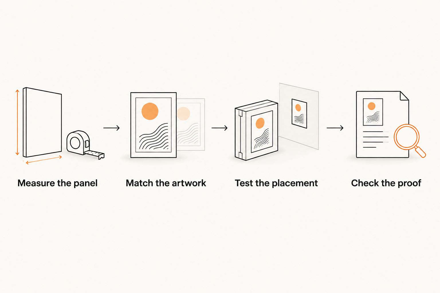
How do you test circle and rectangle stickers before ordering?
Use a paper mockup on the actual packaging before approving the print layout. Your 2026 proof check should confirm both the artwork and its physical fit; reviewing only the digital image leaves placement unresolved.
Measure the panel
Mark the area that remains flat and visible when the package is filled and closed. For a bag, check the front after folding the top; for a box, check the panel after assembly.
Record width and height in the same units. If you are considering a 2-inch circle, cut a paper circle with a 2-inch diameter rather than judging its size from a screen.
Match the artwork
Place the unchanged logo inside each candidate shape. Keep its proportions intact and compare the lettering at the intended printed size.
For an illustrative comparison, test that 2-inch circle against a 3-by-2-inch rectangle. These are mockup dimensions, not recommended sizes for every package or a statement of available product options.
Test the placement
Attach each paper shape temporarily where the finished sticker would go. Close the package, turn it in your hands and check whether the design crosses a fold or hides around a curve.
A sticker that fits an empty bag can behave differently once the bag contains your product. Test the packaging in the condition your customer receives it.
Check the proof
Inspect the cut outline, spelling, orientation and spacing between the artwork and the edge. Confirm the final dimensions instead of treating the on-screen preview as an actual-size view.
Approve the layout only after resolving those details. If you change the shape or dimensions, repeat the physical fit check.
Should packaging text determine the shape?
Yes—when the sticker carries essential text, readability takes priority over the outline. A recognizable logo cannot compensate for a product name that customers struggle to read.
Give each part of the layout a job. The business name identifies the maker; the product name identifies the item; instructions explain use. Making every element equally prominent weakens that hierarchy.
For businesses planning custom candle and soap stickers, the front label also has to distinguish the product from other items in the range. The relationship between branding and product identification is central to custom candle and soap stickers: choose the shape around the information customers need, not around an isolated logo.
A compact mark can sit comfortably in a circle while a longer product name needs a different layout. Do not force both into the same format just to keep every sticker identical.
Required labeling is a separate check. A good-looking sticker is not evidence that the package meets the rules applicable to your product.
What should you check before placing a bulk order?
For a 2026 bulk order, settle the artwork, placement and quantity together. Buying more of an unresolved design only increases the amount you need to store or replace.
Vinylstatus custom sticker buyers should prepare a clear artwork file and an exact placement plan before ordering. Keep the specification practical:
- State the finished shape and dimensions.
- Identify the packaging surface and intended position.
- Check that the smallest text remains readable at actual size.
- Review the cut outline and the space around the artwork.
- Confirm the finish and product details on the current ordering page.
- Base quantity on the packages you expect to use, with a deliberate allowance for application mistakes.
Do not assume every sticker format has the same liner, production schedule or surface suitability. Confirm the details for the selected product, and distinguish production after proof approval from shipping time when planning your deadline.
Recheck your quantity if the packaging artwork includes a product name or version-specific information. A shared logo sticker and a product-specific label have different reorder risks.
Can you use both shapes on the same package?
Yes, if each sticker has a distinct purpose. A circle can carry a compact brand mark while a rectangle organizes product information elsewhere on the package.
The advantage is separation: branding does not have to compete with every line of copy. The disadvantage is another application step and another item to track when ordering.
Before choosing both, ask whether the second sticker adds necessary information. If it repeats the same logo without helping the customer, a single clear label is the simpler choice.
Test the full package together. Two individually balanced stickers can still compete when placed close to each other.
FAQ
Are circle or rectangle stickers better for packaging?
Circle stickers suit compact logos and centered accents; rectangle stickers suit wide logos and structured text. Choose the shape that fits the usable package panel without shrinking essential information.
What size circle sticker should I use on a small box?
Choose the diameter after measuring the box’s usable panel. Test a paper mockup on the assembled box so the sticker avoids folds, openings and panel edges.
Can I put a rectangular logo inside a circle sticker?
Yes, but a wide logo leaves unused space above and below it or needs to become smaller. Compare an actual-size proof with a rectangle before sacrificing readable lettering.
Are rectangle stickers better for product labels?
Rectangle stickers suit product labels with aligned text or a wide reading order. They still need enough flat space to keep important wording visible and away from folds.
Should I choose matte or glossy for packaging stickers?
Choose the finish separately from the shape, considering the appearance you want and the product’s verified options. Review the artwork at actual size because finish does not fix crowded text.
What should I check on a packaging sticker proof in 2026?
For a 2026 packaging sticker proof, check dimensions, spelling, orientation, cut outline and artwork spacing. Compare the proof with a paper mockup on the filled, closed package before approval.
Can Vinylstatus print stickers from my own logo artwork?
Vinylstatus accepts customers’ own artwork for custom stickers. Check the current product details before ordering rather than assuming every shape has identical specifications.
One last thing
The package—not the artwork file—is the final test. Before approving your 2026 order, place the mockup on a filled package and hand it to someone who has not seen the design.
Ask them to identify the business and the product without turning the package or being coached. If they struggle, change the layout or placement before changing the quantity.